MY BRANDING PHILOSOPHY
A brand encompasses the vision, mission and values of a company. It should serve as an aspiration for employees and an inspiration for audiences. It is a business’s “book jacket” holding promise for whoever opens it.
_________
4TH FLR PRODUCTIONS – REBRANDING


_________
AGILIFY – BRANDING
Silver Addy – Integrated Brand Identity Campaign
_________
ARTS COUNCIL OF GREATER BATON ROUGE – REBRANDING
THE CARY SAURAGE CENTER FOR THE ARTS – BRANDING


_________
PORT OF SOUTH LOUISIANA – REBRANDING


- District Gold Addy – Elements of Advertising – Logo Design
- District Silver Addy – Integrated Brand Campaign
- AAF-BR Best of Show – Elements of Advertising – Logo Design
- AAF-BR Gold Addy Elements of Advertising – Logo Design
- AAF-BR Gold Addy – Integrated Brand Campaign
_________
MILTON J. WOMACK – REBRANDING

_________
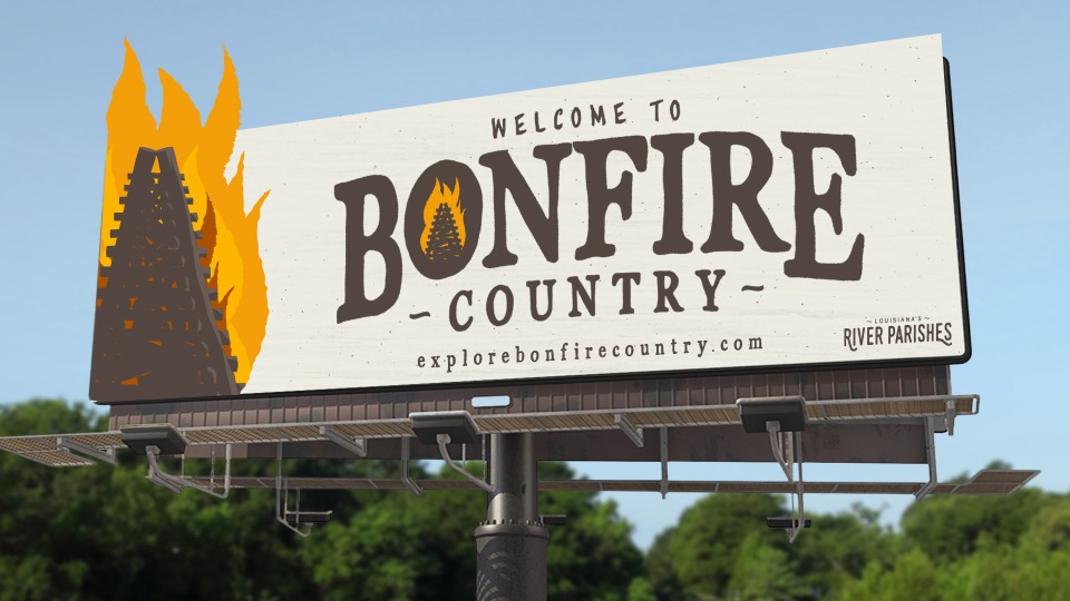
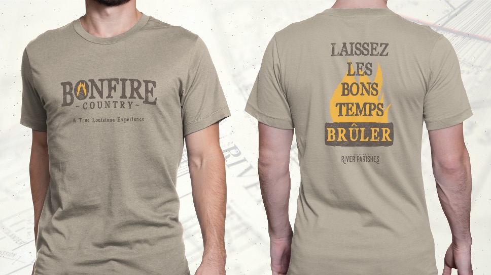
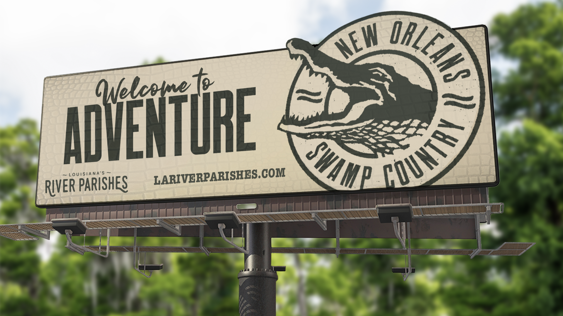
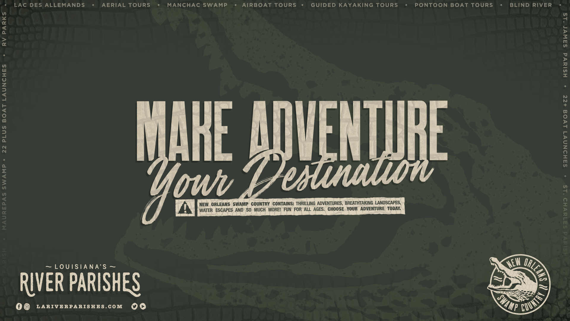
LOUISIANA RIVER PARISHES TOURIST COMMISSION – MULTI-PROGRAM BRANDING & REBRANDING


_________
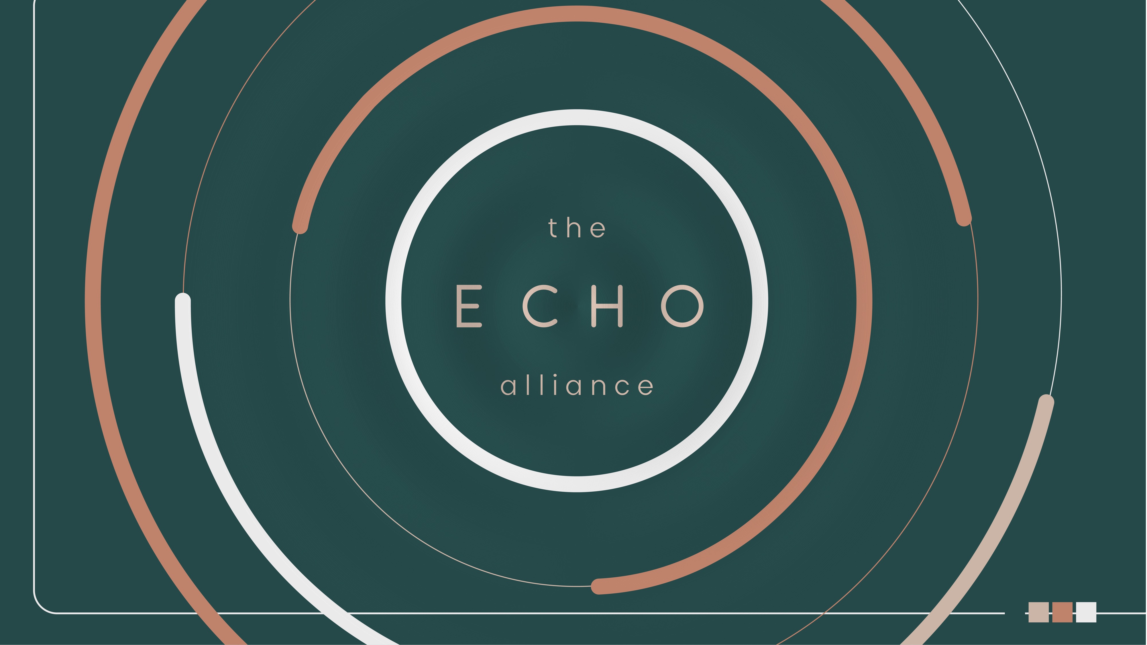
MARY BIRD PERKINS CANCER CENTER – ECHO ALLIANCE – BRANDING & NAMING

_________
LOUISIANA SCHOOL OF SCIENCE, MATH, AND THE ARTS FOUNDATION – REBRANDING